Christian Church Logos: Inspiring Logo Ideas for Churches and Ministries
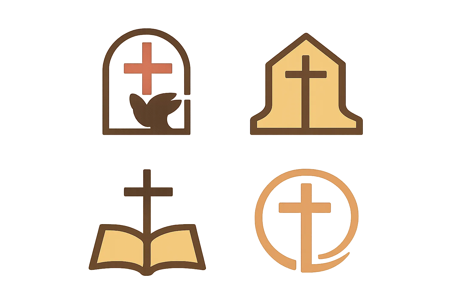
Christian church logos are more than decorative marks. They are visual statements about identity, belief, and community. A well-designed emblem can compress years of mission, values, and history into a single, memorable mark. In this article, we explore logo ideas for churches and ministries, discuss symbolic choices, design principles, and practical guidelines to create logos that endure. Whether you’re refreshing an existing mark or starting from scratch, you’ll find ideas that help a church communicate clearly in a noisy world.
A church logo is not just a pretty symbol; it is a communication tool that reinforces how a congregation sees itself and how others perceive it. A strong emblem helps with:
Brand identity: a cohesive visual language that reflects mission and values.
Recognition: a distinctive mark that appears on signage, print, digital media, and apparel.
Trust: a sense of professionalism and stewardship that invites people to engage.
Storytelling: a visual shorthand for beliefs, history, and community life.
Versatility: a mark that works across scales, from tiny social icons to large banners.
When a church approaches logo design, it helps to frame the work around a simple question: What is the core message we want people to feel in 3 seconds? The answer often points to symbols, typography, and color choices that align with the church’s denomination, cultural context, and ministry focus.
Common Symbols in Christian Church Logos
Many church logos draw on time-honored Christian symbols that carry layers of meaning. Below is a survey of popular icons, with notes about why they work and how they can be adapted for different styles.
The Cross in Its Many Forms
The cross is the most recognizable Christian symbol, but there are countless ways to render it:
Latin cross—the simplest and most direct representation of the Christian story.
Cross with a circle—symbolizes eternity and unity, frequently used in contemporary branding.
Cross with rays or glow—conveys enlightenment, hope, and mission.
Celtic or knot-cross—emphasizes heritage, continuity, and interconnectedness.
Broken or abstract cross—reflects humility, transformation, and grace in modern contexts.
The Dove
The dove frequently represents the Holy Spirit, peace, and renewal. Logos featuring a dove can be elegant and minimalist, or dynamic with motion lines to suggest energy and forward momentum.
The Ichthys or Fish
The fish symbol has historical resonance and can be stylized in a way that feels both classic and contemporary. It works especially well for programs focused on outreach, evangelism, or simplicity of the gospel.
An open Bible or stylized book communicates teaching, scripture, and catechesis. It blends well with other symbols such as the cross, lamp, or flame to express a mission centered on scripture.
Light, Flame, and Lamp
Light concepts—lamps, candles, torches, or beams of light—evoke guidance, truth, and hope. They can pair with architectural silhouettes (like a church steeple) to connect faith with a local community.
Lamb, Shepherd, and Crown
Traditional motifs such as the Lamb of God, shepherd’s crook, or a crown can signify care, leadership, and sovereignty. They often appear in denominations with a sense of history and ritual.
Nature and Creation
Trees, branches, leaves, or mountains can symbolize growth, nurture, and God’s creation. When used thoughtfully, nature-inspired logos communicate warmth and accessibility.
Great logos emerge when design principles are applied with care. Here are core ideas to guide the process:
Simplicity: avoid clutter. A simple mark is easier to recognize and remember.
Scalability: ensure the logo works at small sizes (website favicon, social icons) and large formats (banners, signage).
Timelessness: steer away from trends that will feel dated in a few years.
Versatility: a logo should look good in full color, black-and-white, or two-color versions.
Typography: pair a legible typeface with the symbol, not competing for attention.
Color: choose a limited palette to maintain coherence and emotional impact.
Consistency: align with brand guidelines and ensure coherence across media.
When shaping logo concepts, designers often work through a few routes: a minimal mark that rests on a strong symbol, a logotype that spells out the church name in a memorable way, or a combination mark that integrates text and symbol. Each approach has advantages depending on mission, audience, and context.
Logo Variations for Different Denominations and Styles
Different church contexts benefit from distinct visual directions. Below are categories with examples of how a logo can reflect identity while remaining accessible to broad audiences.
In historic liturgical contexts, logos may emphasize legacy, sacraments, and liturgical color. Variations might include:
Subtle use of cross motifs integrated with a crest or shield.
Incorporation of chalice or host symbols alongside a restrained typographic treatment.
Use of gold and deep blues or purples to signal reverence and tradition.
Protestant and Evangelical Styles
For many evangelical and non-denominational churches, the emphasis is on approachability, mission, and community impact. Logo directions include:
Clean, geometric shapes that convey clarity and modernity.
Symbols that evoke outreach, such as a stylized path, door, or open book with a cross.
Energetic color palettes that communicate hope and invitation.
Pentecostal, Charismatic, and Mission-Focused Groups
Logos for these contexts often emphasize the presence and activity of the Holy Spirit, along with a sense of movement and revival. Consider:
Dynamic shapes that imply movement or wind to symbolize spiritual activity.
Bright accents and gradients used sparingly to avoid visual overload.
Imagery of flame, dove, or light integrated with bold typography.
Church Plants, Campuses, and Ministries
New churches and campus ministries often favor flexible marks that scale well across multiple campuses and media. Ideas include:
Minimal, scalable symbols that can anchor multiple campus identities under one umbrella brand.
Adaptable color families that can be customized for specific locations while preserving core identity.
Logo systems with a main emblem and a set of submarks for youth, worship, and outreach ministries.
Color Theory in Church Logos
Color is a potent tool for conveying tone, mood, and values. When selecting color for a church logo, consider both symbolism and practical constraints such as accessibility and reproduction.
Color Psychology and Symbolism
Blue often communicates trust, calm, and authority; it can signal pastoral care and stability.
Red conveys energy, passion, and sacrifice; used sparingly, it can highlight urgency or mission.
Gold/Yellow implies warmth, glory, and divine light; it can elevate a logo and suggest reverence.
Green suggests growth, renewal, and creation care; good for churches with a focus on sustainability or community development.
Purple signifies tradition and spiritual depth; it can connect with liturgical contexts.
A practical approach is to select a primary color that captures the church’s personality and then offer a secondary palette for variety. Always test colors in black-and-white and ensure adequate contrast for readability and accessibility.
Typography and Letterforms
The choice of typeface profoundly affects legibility and the emotional tone of a logo. Consider these practices:
Serif fonts evoke tradition, dignity, and timelessness; they can work well for historic churches and denominations with a strong sense of lineage.
Sans-serif fonts feel modern, approachable, and clean; they pair nicely with minimalist symbols and digital media.
Custom logotypes can be crafted to echo unique letterforms in the church’s name, yielding a distinctive identity.
Typography should be legible at small sizes and retain character when scaled up for signage.
Pairing typography with a symbol requires balance. The text should not dominate the mark, and the overall composition should be harmonious. In many church logos, the logomark shares the foreground with the logotype, maintaining a unified visual footprint.
Logo Usage and Brand Guidelines
A logo is most effective when its usage is well-defined. Clear guidelines help ensure consistency across all touchpoints, from print collateral to digital media and merchandising.
Clear space: define the minimum area around the logo to prevent crowding by text or imagery.
Logo variations: specify primary, secondary, monochrome, and inverse versions for different backgrounds.
Prohibited uses: outline do-not-distort, rotate, recolor, or add elements that compromise the mark.
File formats: provide vector sources (SVG, EPS, AI) for printing and raster versions (PNG, JPEG) for digital use.
Asset management: catalog logos by version and zip bundles with usage notes for staff and partners.
Case Studies: Notable Logo Concepts for Churches
The following case studies present fictional examples inspired by real-world practice. They illustrate how different design choices support distinct missions without copying any existing marks.
Case Study A — Urban Church with a Minimal Cross in a Circle
Concept: A clean cross enclosed within a circle, using a restrained palette of two colors. Rationale: The circle communicates unity and community; the cross anchors the Christian narrative. Use-case: signage, social media icons, and print materials for a city congregation with a modern, welcoming vibe.
Case Study B — Compassion Ministry with a Open Book and Flame
Concept: An open book with a rising flame above it, symbolizing instruction and spiritual renewal. Rationale: Emphasizes teaching, outreach, and dynamic faith. Use-case: education programs, outreach campaigns, and youth ministry branding.
Case Study C — Multisite Church with a Logo Family
Concept: A core emblem—a stylized lamp—paired with a logotype that can be accompanied by submarks for different campuses (e.g., North Campus, Downtown Campus). Rationale: A flexible branding system that preserves a unified identity while enabling location-specific expression.
Case Study D — Traditional Parish Emblem
Concept: A heraldic-inspired shield with a cross and a Bible motif, finished in muted gold and deep blue. Rationale: Conveys history, liturgy, and a sense of rootedness. Use-case: newsletters, formal documents, and worship bulletins.
Case Study E — Youth-Focused Outreach Logo
Concept: A bold, geometric mark featuring an upward arrow integrated with a cross and a friendly sans-serif logotype. Rationale: Appeals to younger audiences and communicates forward momentum, hope, and invitation.
Creating a Logo: Step-by-Step Process
The process below is a practical framework for churches working through logo development, refresh, or rebranding. It balances strategic thinking with creative exploration.
Discovery: gather information about the church’s mission, values, demographics, and aspirations. Interview pastors, staff, volunteers, and a sample of congregants. Define the target audience and core messages to convey.
Strategy: articulate a positioning statement, outline the church’s narrative, and identify 2–3 key symbolism anchors (for example, «growth and gospel,» or «communion and community»).
Concept development: brainstorm multiple directions (symbol-first, typography-first, or combination marks). Create thumbnail sketches and rough digital drafts.
Design refinement: select 3–5 concepts to test with stakeholders. Refine shapes, spacing, color, and typography. Ensure accessibility and legibility across sizes.
Validation: test across media (website, signage, merchandise, social icons) and ensure compatibility in color and grayscale. Gather feedback and adjust as needed.
Delivery: finalize logo packages, including color and black-and-white versions, web and print-ready files, and brand guidelines. Provide templates for common use cases.
Rollout and guidelines: implement a phased rollout, update signage and collateral, and communicate the rebrand to the church family with a clear rationale for the change.
Even well-intentioned logos can derail if care is not taken in implementation. Watch for these pitfalls:
Overcomplex designs that lose clarity at small sizes or when printed large.
Too many colors that complicate printing and reproduction.
Copying trends that will look dated in a few years.
Ambiguous symbolism that confuses rather than clarifies the church’s identity.
Inconsistent usage across materials that erode brand consistency.
Practical Tips for Implementing a New Logo
If you’re overseeing a logo project for a church, several practical steps can help ensure success and buy-in from the community.
Involve diverse voices from the congregation early in the process to ground the design in lived experience.
Produce a mood board or style guide that captures the desired tone—whether timeless, contemporary, or spiritually evocative.
Test the logo in daily-use contexts (bulletins, slides, social media) to confirm legibility and impact.
Provide an accessible color system with high-contrast options for people with visual impairments.
Develop a cohesive family of marks, including a main emblem and consistent submarks for ministries or campuses.
Top Trends in Church Logos (Current and Enduring)
While timeless design is the aim, some trends can inform thoughtful decisions without compromising longevity.
Simplified geometry and minimalism for rapid recognition across devices.
Monochrome variants that preserve impact in print, embroidery, or dirt-friendly contexts.
Flat design with subtle shadows or gradients used sparingly, to avoid tech fatigue.
Hybrid marks that pair a symbol with a clean logotype, enabling a robust brand system.
Accessibility and Inclusivity in Logo Design
Logos should be accessible to everyone. Consider these inclusivity principles:
Ensure sufficient color contrast against common backgrounds for readability.
Avoid relying solely on color to convey meaning; include distinct shapes and textures that carry the message.
Provide alternative text for logos on digital platforms to assist screen readers.
Test the logo with a diverse audience to identify potential misinterpretations or barriers.
Frequently Asked Questions About Church Logos
Here are concise answers to common questions that churches ask during the design process.
Q: Should we use a cross in our logo? A: Many churches include a cross, but it’s not mandatory. A cross can be a clear and faithful symbol when it resonates with your community. If used, consider a unique treatment to avoid overfamiliarity.
Q: How many colors should we use? A: Start with 2–3 core colors for versatility and reproduction clarity. You can add a secondary color for special campaigns, but avoid complexity that muddles the mark.
Q: Can a logo age gracefully? A: Yes, with timeless shapes, restrained typography, and a scalable concept that remains legible as media changes.
Q: How do we protect our logo? A: Create brand guidelines, register trademark considerations if appropriate, and ensure staff and volunteers understand the do’s and don’ts for usage.
Conclusion: Crafting a Meaningful Emblem
A church logo is a bridge between spiritual identity and daily life. When designed with care, a logo becomes a trustworthy beacon that signals welcome, doctrine, and service. The best church logos are not flashy showpieces; they are quiet, robust marks that invite dialogue, reflect a story, and stand the test of time. By embracing symbols with layered meaning, applying disciplined design principles, and building a cohesive brand system, churches can communicate clearly across generations and cultures.
Whether you are refreshing a current mark or launching a new logo for a church or ministry, remember that the goal is not only to look good but to align visuals with mission, support outreach, and help people feel at home in the community. The right emblem can become a trusted companion on the journey of faith—visible, memorable, and enduring.











Publicar comentario