Church Sign: Creative Ideas and Design Tips to Attract Visitors
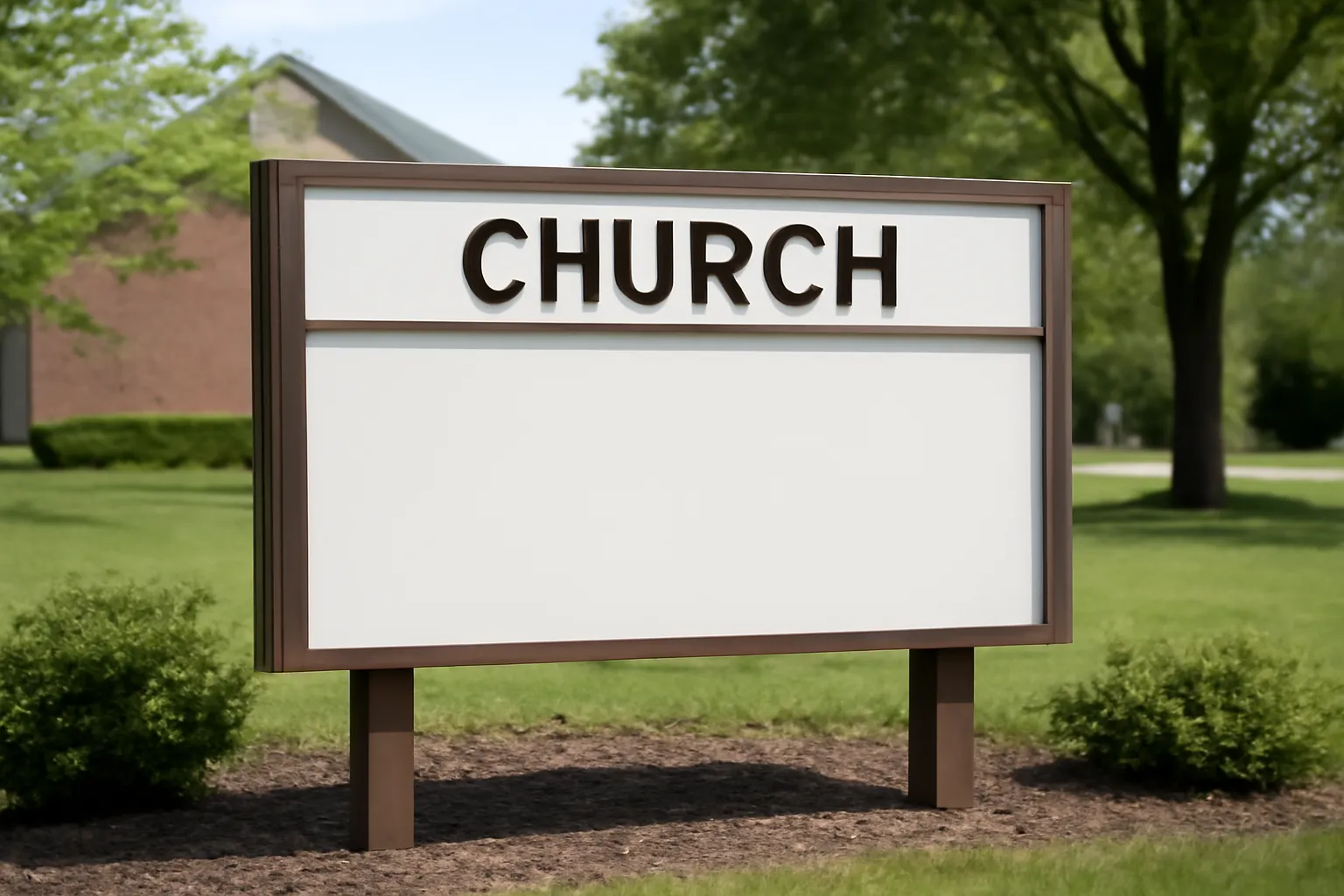
Church signs are one of the most visible entry points to a faith community. Whether you call it a church sign, a church marquee, a yard sign, or a faith display, the goal remains the same: invite, inform, and engage people near your building. A well-crafted sign can communicate welcome, share essential information, and spark curiosity about worship, service times, and community programs. In this guide, you will find creative ideas, design tips, and practical best practices for every kind of sign—from traditional static boards to vibrant digital displays. We will explore how to use typography, color, layout, and content to attract visitors while staying true to your church’s voice and mission.
This article covers a broad range of signs—outdoor church signs, marquee messages, open house boards, and digital display panels—and shows how to tailor messages to seasons, events, and community needs. If you are starting from scratch or refreshing an aging church sign, the ideas here aim to help you create signs that are legible from a distance, easy to update, and meaningful to passersby.
Basics of Sign Design for a Church or Faith Center
An effective sign system combines clarity, relevance, and visual harmony. The core principles of sign design—legibility, contrast, hierarchy, and consistency—apply across all formats. Start by defining who your audience is, what you want them to do, and the tone that fits your community. Then choose a structure that can be updated quickly and is robust enough to endure weather and foot traffic.
Readability and Legibility
READABILITY is not the same as beauty. A successful church sign uses large, simple type and a maximum of two or three messages per board. Consider these basics:
Font size: Use at least 3 inches for main messages on outdoor boards, larger if distance is a key factor.
Typeface: Favor clean sans-serif fonts for headlines and limited serif or rounded fonts for emphasis; avoid complex script fonts that hinder quick reading.
Line length: Limit lines to 8–12 words each to prevent wrapping and confusion.
Contrast: Ensure strong contrast between text and background (e.g., white letters on navy or black on light backgrounds).
Lighting: If your sign is visible at night, integrate lighting that does not glare or wash out the message.
Color Theory
Colors convey mood and urgency. For church signs, use colors that reflect your branding while maintaining readability. Consider:
Blue and green for calm, trustworthy vibes and a welcoming atmosphere.
Gold or plum accents for warmth and formality when appropriate.
Red sparingly to highlight time-sensitive information or special events.
Avoid color combinations that cause color-blind readability issues (e.g., red-green combos in critical information).
Typography is more than choosing a font; it sets rhythm and emphasis. Atypical or decorative fonts can slow readers down, so reserve them for emphasis or brand elements. Practical suggestions include:
Hierarchy: Use a single bold headline, a secondary line for the time or location, and a smaller line for the call to action.
Consistency: Use the same font family across the entire sign system to create cohesion.
Spacing: Allow ample leading (line spacing) so close lines do not appear cramped.
Abbreviations and icons: Use universally understood icons (church cross, clock, location pin) to reduce word load when space is tight.
Layout and Hierarchy
A clear layout helps people process information quickly, which is essential for roadside or passerby readers. Consider these layout patterns:
Z-pattern or F-pattern reading flow to guide the eye from the most important item to supporting details.
Place time and place on a dedicated line, separate from the welcome message.
Reserve a dedicated call to action (e.g., “Join us Sundays at 9:30”) at the bottom, aligned for readability.
A sign serves a diverse community. Make sure your message is accessible to people with different abilities:
Use high-contrast colors and large type for those with low vision.
Avoid relying solely on color to convey information; include text redundancy where possible.
Position signs at eye level for pedestrians and at higher elevations for drivers, ensuring both audiences can read clearly.
Durability and Maintenance
Outdoor church yard signs face weathering. Design for longevity by choosing weather-resistant materials and planning for regular upkeep:
Use weather-resistant paint, vinyl lettering, or powder-coated metal components.
Plan routine cleanings and paint touch-ups to keep the sign legible.
Design the layout so small updates (like a new service time) can be swapped quickly without changing the entire board.
Content Strategy: What to Put on a Church Sign
The content on a church sign should be succinct, relevant, and action-oriented. Think of the sign as a mini message that invites people to learn more. Below are practical approaches to crafting compelling messages across different formats, from traditional marquee boards to digital displays.
Clear and Concise Messaging
The most effective church signs deliver a single idea at a time. You can convey:
Worship times and location
Upcoming events or series (e.g., “Discovering Faith: A Free Study”)
A warm welcome (“All are welcome to join us this Sunday.”)
Event Information and Calendar Snippets
For ongoing events and programs, use a predictable cadence so nearby residents learn what to expect. Examples:
Sundays at 9:30 a.m. | Contemporary Worship
Wednesday Bible Study at 7:00 p.m. — Childcare available
Community Meal on the first Friday
Seasonal and Thematic Messaging
Tying your message to the season helps the sign stay fresh and relevant. Themes to consider:
Advent and Christmas: “Hope is Born Here” with service times.
Lent and Easter: “Seeking Spirit-Filled Fridays” or “Resurrection Hope this Sunday.”
Back-to-School: “Hope for Every Student” with a community resource fair.
Calls to Action
Effective calls to action are direct and actionable. Examples:
Join us this Sunday for worship and a welcoming coffee bar.
Visit our website for small groups and volunteering opportunities.
Text SIGNUP to 555-0100 for event reminders.
Variations for Different Sign Formats
Consider the variations below to tailor content to the specific format:
Outdoor church sign: concise, high-contrast lines; one or two lines max.
Digital marquee: rotating messages, weather-safe animations, timely updates.
Bulletin boards: longer copy, event details, QR code for more information.
Open house boards: directions, parking instructions, contact.
Creative Ideas and Design Tips to Attract Visitors
Creativity in church signage does not require gimmicks. It requires authenticity, clarity, and a thoughtful blend of design and message. Below are idea pools and practical tips for generating fresh, engaging signs that communicate warmth and invite curiosity.
Idea Pool: Copy Themes
Use these thematic directions to spark sign copy, while keeping the church’s voice intact:
Welcome and hospitality: “You are welcome here.”
Wonder and curiosity: “What is faith? Find out this Sunday.”
Service and worship: “Singers, strings, and message of hope.”
Community and service: “Serving together, growing together.”
Invitations: “You belong here.”
Sign Variations to Maximize Reach
Different signs serve different purposes. Consider the following modalities:
Marquee boards for weekly schedules and seasonal themes.
Digital message centers for real-time updates, weather-related changes, or urgent announcements.
Open house or directional signs for new visitors to locate the entrance, parking, and welcome desk.
Community bulletin plaques that highlight local partnerships and volunteer opportunities.
Seasonal Copy Calibration
Seasonal lines can energize engagement if crafted carefully. Suggested templates:
Spring: “Renewal starts here—join us this Sunday.”
Summer: “Find rest and community this week.”
Fall: “New studies begin this week—discover your path.”
Winter: “Peace on earth, good news for all—worship with us.”
Words alone do not tell the whole story. Help your message with visuals that reinforce meaning without distracting:
Simple icons for worship, study, service, and prayer.
Seasonal artwork that remains respectful and tasteful.
High-contrast border elements to frame the message.
Subtle textures or patterns that convey warmth without reducing legibility.
Examples of Ready-to-Use Copy
Use these as starting points, adapting to your local context and voice:
“All are welcome. Worship with us Sundays at 9:30 a.m.”
“Small groups start this week. Find your people here.”
“Serving our community together — volunteer opportunities this Saturday.”
“Children’s ministry every Sunday morning.”
“Christmas Eve services at 4 p.m. and 6 p.m.—light, hope, and joy.”
Practical Copywriting Rules of Thumb
To ensure messages remain effective over time, keep these guardrails in mind:
Limit to three ideas per sign, with the strongest idea first.
Avoid jargon or church-speak that might confuse newcomers.
Lead with welcome or “You are invited” to set a friendly tone.
Test variations periodically to learn what resonates with your neighborhood.
Sign Types and How to Use Them Effectively
Different physical formats require slightly different design approaches. Here are the most common types and practical tips for each.
Static Outdoor Signboards
The classic outdoor church sign is a trusted anchor for a faith community. Keep these recommendations in mind:
One or two lines max, with a bold headline.
Weatherproof materials: aluminum, powder-coated steel, or durable wood with varnish.
Replaceable insert panels for updated messages.
Marquees and Digital Displays
Digital and electronic message centers offer versatility and high visibility. Consider:
Sequence messages logically (welcome, time, location, event).
Use motion sparingly to avoid distraction and motion sickness; opt for gentle transitions.
Keep a caption policy: avoid long sentences; use fragments that can be read in a few seconds.
Residential-Style Yard Signs and Open-Where You Park Signs
When approaching the campus from the street, yard signs and directional boards help people find the door and parking. Design tips:
Include a simple icon (parking, welcome desk, kids zone).
Place at corners or intersections with clear sightlines.
Use weather-resistant frames and grommets for easy mounting.
Multi-Panel and Corner Signage
For campuses with multiple entrances or ministries, a multi-panel or corner sign can present a mini map or a clean menu of offerings.
Panel 1: Welcoming message and service times.
Panel 2: Programs for families and youth.
Panel 3: Volunteer and giving information.
Placement, Maintenance, and Practical Considerations
The physical location of a church sign matters almost as much as the copy it carries. Strategic placement increases visibility, while thoughtful maintenance preserves credibility. This section outlines best practices for sign placement, frequency of updates, and safety concerns.
Location, Visibility, and Traffic Flow
When choosing where to install or renew a sign system, consider:
Line of sight from major approach routes, including both vehicle and pedestrian perspectives.
Distance readability: ensure the message can be read from the typical speed of traffic near the site.
Proximity to entrances and the welcome desk to reinforce the invitation.
Legal requirements and zoning rules for signage size and placement.
Timing and Update Cadence
A cadence that feels fresh without being chaotic works best. Some suggested schedules:
Weekly rotation for service times and weekly events.
Seasonal refresh every 2–3 months to align with liturgical seasons or ministry emphases.
As-needed updates for weather closures or impromptu community opportunities.
Maintenance Protocols
Regular maintenance prevents signs from appearing neglected. Consider:
Weekly inspection of hardware and mounting integrity.
Monthly cleaning to remove dirt, bird droppings, and grime that obscure readability.
Quarterly checks for fading colors or damaged panels and timely replacements.
Legal and Safety Considerations
Respect local regulations about sign height, lighting, and placement. Additionally, follow safety standards:
Ensure electrical work for lighting or digital displays complies with local codes.
Avoid sharp edges or hazardous mounting materials.
Obtain necessary permissions for sign ownership and shared property signs when applicable.
Measuring Impact: How to Know If Your Church Sign is Working
It is important to understand whether your sign is succeeding in its outreach goals. Signage effectiveness can be assessed through a mix of informal observation and data-driven approaches.
Collect qualitative feedback from visitors, volunteers, and neighbors. Methods include:
Short in-person conversations with first-time visitors about what attracted them.
Small surveys at the welcome desk asking, “What helped you notice our sign?”
Observational notes on which messages drew a reaction or question.
A/B Testing for Sign Messages
If you have multiple signs or digital boards, consider controlled testing:
Rotate two or three different headlines over a set period (e.g., two weeks each).
Track inquiries, attendance, or website clicks associated with each message.
Adopt the higher-performing option for longer-term use.
Community Metrics
While you should not rely solely on sign metrics, they can complement broader church analytics:
Attendance trends around certain events or Sundays.
Volunteer sign-ups following a particular program advertised on the sign.
Website or social media engagement driven by sign announcements.
Annual Review and Sign Refresh
Schedule an annual or semiannual review of your sign strategy. Use a checklist to assess readability, relevance, consistency, and alignment with the church calendar.
Is the primary message still the most compelling invitation?
Are the service times accurate and up-to-date?
Is the color palette consistent with branding and accessible?
Do you have a plan for seasonal updates and special events?
Case Studies: Sign Success in Real Communities
Real-world examples illustrate how thoughtful church signage can improve visibility and welcome. Here are three concise scenarios that demonstrate different approaches.
Case Study A: A Small Rural Church with a Classic Marquee
A rural church implemented a two-line marquee with bold, high-contrast text and a rotating weekly line for “Worship Sunday 9:30 a.m.” and a seasonal message such as “Outdoor Easter Pageant This Sunday.” Within three months, they observed an uptick in first-time visitors who mentioned reading the sign while passing by.
Case Study B: A Multisite Urban Campus Embracing Digital Signs
An urban church campus installed a digital display with a welcoming message, scripture snippet, and next event. They used short, punchy copy and legible icons. The digital sign enabled them to communicate weather-related changes quickly and to promote last-minute service opportunities. The result was a 20% increase in RSVPs for midweek programs over a six-month period.
Case Study C: Creative Community Board with Clear Directions
A church placed a visually cohesive corner sign that combined a welcome note, a map to the entrance, and a QR code linking to a visitor guide. The QR code provided new visitors with a simple way to learn about ministries, childcare, and community groups before stepping inside. This approach helped reduce confusion and created a smoother first-visit experience.
Best Practices and Final Considerations
To maximize the impact of your signage, blend consistency with innovation. Maintain a recognizable identity across all sign formats, but allow space for timely updates that reflect your church’s current priorities and community needs.
Best Practices Recap
Clarity first: Short, direct messages read quickly at a glance.
Brand alignment: Use your church’s color palette and fonts consistently across signs.
Accessibility: Ensure readability for people with different abilities and provide text alternatives where possible.
Seasonal relevance: Refresh content to stay relevant to the community and liturgical calendar.
Maintenance: Regular updates and upkeep preserve credibility and trust.
A well-designed church sign system is more than a message on a board. It is an invitation, a guide, and a gateway to your community. By focusing on readability, thoughtful content, and consistent branding, you can create a welcoming presence that is both inviting to newcomers and affirming for long-time members. The goal is not merely to announce events, but to convey hospitality, hope, and a sense of belonging. In the end, your signage should reflect the heart of your faith community: a generous invitation to explore, grow, and serve together.







Publicar comentario